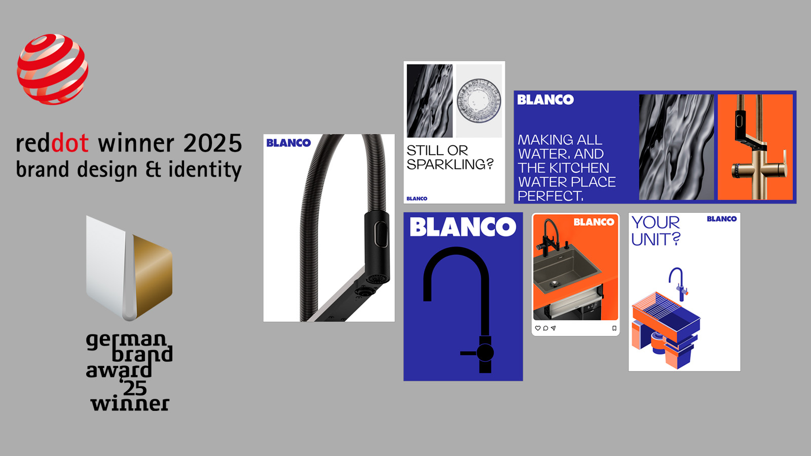
BLANCO wins Red Dot Brands & Communications Design Award 2025
100 years of BLANCO – an anniversary year showcasing the fruits of the pioneer’s visionary brand transformation for the kitchen water place
Oberderdingen, 20 August 2025 – A constant willingness to evolve, a clear focus on the kitchen water place, and a strategic vision: these factors are paying off in a special way for BLANCO this year. After already receiving the “German Brand Award 2025” a few months ago, the company has now been honoured with the prestigious “Red Dot Brands & Communication Design Award 2025”, crowning the successful brand realignment of the pioneer of the kitchen water place.
Setting uncompromising standards in terms of design and communication quality in its vote, the international jury of the Red Dot Award only confers this distinction on brands that impress with visionary concepts and outstanding design solutions. This latest recognition thus underlines the successful transformation BLANCO has undergone in recent years, culminating in its new brand identity. "The fact that we're once again receiving such an important award in our 100th anniversary year means this is a very special moment for us,” says Daniela Römgens, Vice President Global Brand Marketing at BLANCO. “It confirms that our decision to hone the brand image and position it more clearly was the right one. This second award within such a short space of time is a wonderful acknowledgement of the commitment of our entire team – and at the same time an incentive to continue shaping our future with the same courage and foresight.”
Why the new brand identity makes the difference
With the aim of also visually consolidating the transformation from a classic sink manufacturer to a system provider for the kitchen water place, a brand identity was created that unites modernity, clarity and innovative strength. With its high-quality solutions that combine design, functionality and durability – brought together in the BLANCO UNIT as a seamlessly integrated system – the company distinguishes itself within the industry in a visually concise and unmistakable way. "Making this added value more visible to our customers and consumers was very important to us," emphasises Roemgens.
In collaboration with the creative agency Strichpunkt, BLANCO has developed characteristic visual elements that clearly convey the new brand identity: striking colour schemes, modern typography and purist imagery ensure clear recognisability while succinctly expressing the brand’s confident positioning. At the same time, the concise BLANCO logo that has shaped the brand image since the 1980s remains an integral part of the new identity, combining modernity with tradition.